A white dial, thin hands and a few carefully spaced numbers are enough to get almost any watch called Bauhaus. They are not enough to establish its history. The interesting question is how a design arrived at that simplicity: through a designer’s training, an older industrial drawing, a movement constraint or a deliberate luxury aesthetic.
Nomos Tangente and Junghans Max Bill make that distinction unusually clear. Both are associated with modernist design, but their routes to the wrist differ. Put a Lange Saxonia Thin alongside them and the picture becomes more useful still. It looks restrained without needing to borrow either watch’s origin story.
The Bauhaus connection is an influence, not a factory pedigree
The Bauhaus operated from 1919 to 1933. As Nomos explicitly points out in its account of Tangente’s development, the school did not produce wristwatches. Calling a current watch Bauhaus therefore describes a relationship to ideas or people, rather than membership of an original catalogue.
That distinction leaves room for a broader design history. Nomos connects its dial tradition to the Deutscher Werkbund and functional industrial design. Its research identified a 1937 Glashütte watch using a Weber & Baral dial. After the company’s founding in 1990, graphic designer Susanne Günther developed the proportions and typography of what became Tangente, launched in 1992. Nomos also joined the Werkbund that year.
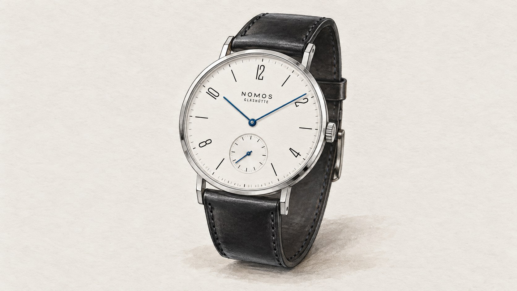
This is a more convincing account than the claim that someone simply removed decoration. Tangente has decoration of a very particular sort: numerals with character, conspicuous blue hands and straight lugs. The achievement is their relationship, not their absence.
Max Bill brings an identifiable designer into the story
Junghans provides a different connection. Its Max Bill history describes an architect, artist and product designer whose work was shaped by Bauhaus ideas of reduction and practical use. His clocks preceded the wristwatches, which followed in 1961. The present collection carries a named designer’s approach across different scales of timekeeping.
Compare the current automatic 27/3500.02 with Tangente rather than treating both as one visual recipe. The Junghans uses fine Arabic numerals around the dial, central seconds and a domed crystal. Tangente places small seconds in a separate circle and interrupts its hour markers with a more assertive numerical vocabulary. One feels softer in outline, the other more architectural. Those are readings of their visible forms, not claims about how either feels on the wrist.
The comparison also shows why the term minimalist is incomplete. A full set of numbers can remain visually quiet. Removing numbers can make a watch less informative without necessarily making its design better.
Three restrained watches, three technical decisions
| Modern watch and reference | Case diameter × thickness | Movement and reserve | Design distinction |
|---|---|---|---|
| Nomos Tangente 139 | 35 × 6.6 mm | Manual DUW 4001; 53 hours | Angular numerals, blue hands, small seconds |
| Junghans Max Bill Automatic 27/3500.02 | 38 × 10 mm | Automatic J800.1; 38 hours | Fine Arabic numerals, curved crystal, central seconds |
| A. Lange & Söhne Saxonia Thin 201.027 | 37 × 5.9 mm | Manual L093.1; 72 hours | White gold, baton markers, hours and minutes only |
The specifications help explain the different objects behind the dial photographs. Tangente’s hand-wound movement supports a thin case and asks its owner to wind it. The Max Bill’s automatic movement adds self-winding and a thicker profile. Neither arrangement is dictated by the colour of the dial or the school of design invoked in the marketing.
Likewise, the sapphire crystal on the current Junghans reference matters when comparing offers. It should not be confused with the acrylic crystals associated with some earlier Max Bill watches. A familiar design name can survive a material change, so history is a starting point for identifying a watch, not a substitute for its full reference.
Why the Saxonia Thin belongs in the comparison
Lange’s 201.027 removes even the seconds display. It combines a solid-silver argenté dial with white-gold hands and markers inside a white-gold case. Its manual L093.1 movement is 2.9 mm thick and provides 72 hours of reserve. The design places unusual emphasis on the space around two hands and a ring of batons.
That spare appearance does not establish a direct Bauhaus lineage. Nor does the historical presence of an A. Lange & Söhne watch in Nomos’s dial research prove that this modern Saxonia Thin descends from the same drawing. Shared visual restraint is evidence of resemblance; authorship requires a more specific record.
Including the Lange is therefore useful precisely because it broadens the choice. A buyer may want the craft and material expression of a thin precious-metal watch, the recognisable typography of Tangente, or the rounded, number-led composition of Max Bill. All can suit a quiet wardrobe without being interchangeable design statements.
Read the dial before accepting the label
Start with what the design helps you do. Decide whether central seconds or small seconds is easier to follow, whether you want every hour numbered, and whether manual winding appeals. Then examine the edges: the lugs, crystal and transition from case to strap. Much of the personality lives outside the empty space that first attracts attention.
Bauhaus remains a useful word when it opens a discussion about function, proportion and the designer’s choices. It becomes less useful when it flattens different histories into a white-dial category. Tangente, Max Bill and Saxonia Thin reward looking past that category, because each has a distinct reason for being simple.
Based on manufacturer information. Specifications checked on 8 September 2026.
Sources: Nomos UK Tangente reference 139; Nomos Tangente origins, Susanne Günther and 1937 dial ancestry; Nomos DUW 4001 technical information; Junghans exact 27/3500.02 product specifications; Junghans Max Bill design history, J800.1 and care guidance; Saxonia Thin exact specifications; Saxonia Thin design and movement history.
Image: AI-generated editorial illustration of the Nomos 139. Design details are approximate; this is not a product photograph.