A luminous dial photograph can be irresistible: bright markers, sharp hands and a watch apparently ready for the darkest room. It is also only one moment under one set of conditions. To judge low-light usefulness, understand how the display receives energy, how the brightness changes and which information remains readable.
Lume is the familiar shorthand for luminous material on hands, markers or other parts of a watch. On the modern examples here, the key idea is stored light energy being released gradually after the surroundings become darker.
Light in, light out
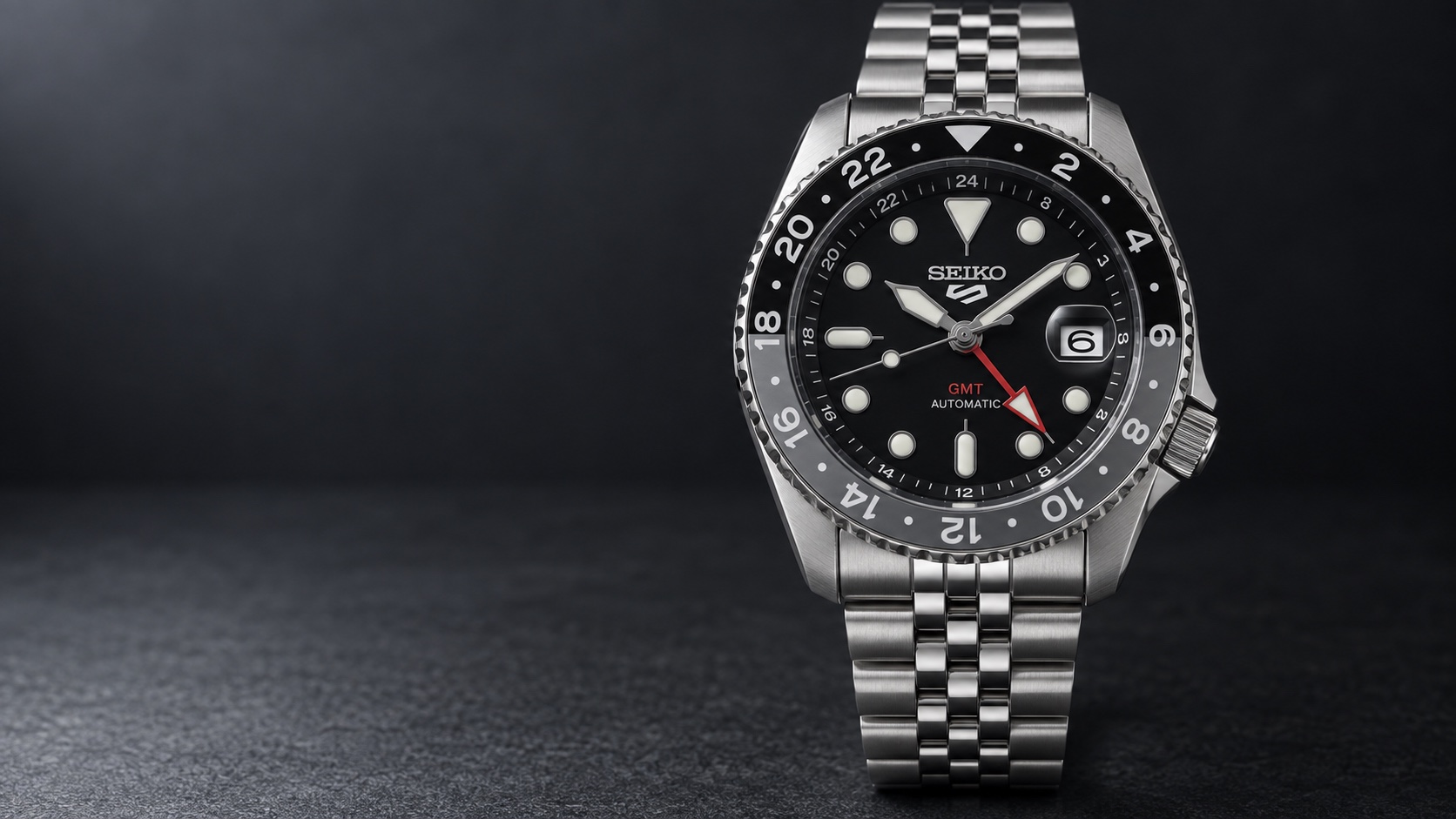
Seiko describes Lumibrite as a material that absorbs light and then emits it in darkness. Its instructions explain that brightness decreases over time, with the duration affected by the light exposure and the distance from the source. A freshly illuminated watch therefore does not represent its brightness several hours later.
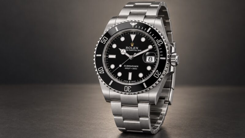
Rolex’s Chromalight follows the same broad stored-light principle. Its familiar appearance is white in daylight and blue when glowing. The material is part of a display system that includes the shapes and positions of the hands and hour markers.
Lume does not charge an automatic watch’s mainspring. Light-powered movement charging and luminous paint are separate functions. A mechanical watch can have a bright low-light display while still relying on winding for the energy that moves its hands.
The shape of the display matters
| Reference | Display feature | Watch context |
|---|---|---|
| Rolex Submariner Date 126610LN-0001 | Chromalight hands, indices and bezel zero | 41 mm automatic diver; 300 m |
| Tudor Pelagos 39 M25407N-0001 | Luminous hands, indices and bezel markings | 39 mm titanium diver; no date |
| Seiko SSK001K1 | Lumibrite on hands and indices | 42.5 mm automatic GMT |
| Casio A168WA-1 | Electroluminescent backlight | Digital quartz; approximately 7-year battery life |
A distinctive marker at twelve helps orient a dial when its printed text is no longer visible. Different hand shapes help separate hours from minutes. The luminous zero on a dive bezel links a timing scale to the dial, making more information available than the time alone.
Those design choices deserve attention alongside raw brightness. A very bright display with ambiguous hands can be less useful to an individual reader than a simpler pattern with a clear orientation point. Look at what you can identify, not just how much of the watch lights up.
Backlighting is a different approach
The Casio A168 uses an electroluminescent backlight to illuminate its digital display. That is a powered light function rather than the gradual release of previously absorbed light from painted hands and markers. The control and battery are part of how that display is used.
Casio dates the A168 to 1995 in its official history. Its blue-green illumination became part of the model’s familiar character, showing how a practical night-reading feature can also help establish a watch’s identity.
The comparison is useful because a digital watch does not need to imitate a luminous analogue dial to be useful in darkness. It presents the same basic information through a different display and operating routine.
Chromalight has its own development story
Rolex introduced Chromalight in 2008 and records a further improvement to the display in 2021. Its blue glow is now closely associated with the brand’s modern sports watches, but familiar case names have existed across earlier luminous-material generations.
This matters when looking at older examples. The name Submariner or Explorer does not by itself identify the luminous material on a particular year’s watch. Changed hands or dials can add another layer. For a vintage purchase, the actual components and their history deserve more attention than a current collection photograph.
How to read a lume comparison
Ask whether the watches received the same light exposure and whether the photographs were taken after the same elapsed time. Camera exposure and image processing also affect how bright the result appears. Two unrelated promotional images are weak evidence for declaring one watch the longer-lasting performer.
A useful comparison should state its method and distinguish initial brightness from later legibility. If that information is absent, enjoy the photograph as a view of the design rather than treating it as a controlled endurance test.
The images accompanying this guide illustrate the watches and their design. They do not establish measured brightness or duration. Those performance claims need evidence from a defined test or a clearly stated manufacturer specification.
Choose for the information you need
Consider whether you want to read the time without pressing anything, whether a backlight control is convenient, and whether you need an elapsed-time bezel or another function visible too. These questions lead to a more useful choice than judging the colour of the glow alone.
Low-light readability combines material, shape, energy and viewing conditions. A good watch makes the important information recognisable after the decorative details disappear. That is the feature worth looking for when the impressive photograph has done its job of catching your attention.
Based on manufacturer information. Specifications and sources checked on 8 September 2026.
Sources: Rolex 126610LN specifications; Rolex Submariner timeline; Rolex Submariner collection; Pelagos 39 specifications; Pelagos 39 design and movement; Tudor Pelagos 39 history and press dossier; Seiko UK SSK001 specifications; Seiko 2022 GMT launch; Seiko 4R34 instruction manual; Casio UK A168WA-1YES; Casio 1990s history: A168 launch in 1995; Casio water-resistance care guidance; Seiko Lumibrite operation and fading; Rolex Chromalight material and 2008 introduction; Rolex 2021 Chromalight development.
Image: AI-generated illustration. Fine details may differ from the watch.