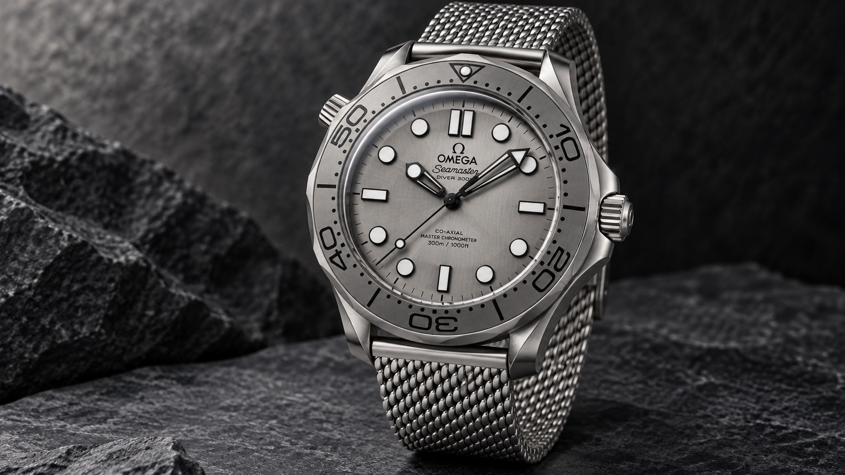
The grey steel-dial Seamaster is for someone who likes the Diver 300M’s outline but finds the familiar blue waves too busy. Its brushed surface and mesh bracelet pull the watch in a different direction. The change is more substantial than choosing another dial colour: you also lose the date and gain a different bezel treatment.
The right comparison is therefore between complete references. This guide anchors on 210.30.42.20.06.002 and compares the blue ceramic-dial 210.30.42.20.03.001. A dial-material argument alone misses most of what will distinguish them in everyday use.
The history behind the choice
Omega introduced the Diver 300M collection in 1993. The wavy dial became a recognisable part of its identity, so removing those waves is a meaningful design decision. In November 2024, Omega announced a new group inspired by the Diver 300M 007 Edition associated with No Time To Die. The range paired domed crystals and mesh or rubber options with different material treatments. One steel-cased version combined a titanium bezel with a brushed, PVD-treated stainless-steel dial, rather than the ceramic-wave approach. That is the branch examined here. It shows a collection revisiting its visual language without abandoning the distinctive case silhouette. Buyers can choose how much of the familiar wave motif they want their own Seamaster to express.
The exact reference
| Specification | Published detail |
|---|---|
| Reference | 210.30.42.20.06.002 |
| Case | 42mm stainless steel |
| Thickness / length | 13.80mm / 49.70mm lug-to-lug |
| Dial / bezel | Brushed PVD steel dial / grade 5 titanium bezel |
| Movement | Automatic calibre 8806; Master Chronometer |
| Stated reserve | 55 hours |
| Water resistance | 300m |
| Published weight | Approximately 158g |
| Crystal | Domed sapphire; antireflective treatment inside |
| Bracelet | Stainless steel mesh |
| Calendar | No date |
The face changes the entire mood
On the blue reference, the dial’s engraved waves and the surrounding blue ceramic create a strong colour-and-pattern statement. The grey version substitutes directional brushing and a much narrower palette. In product views, it reads as more industrial and less overtly decorative. Neither treatment is inherently the correct face for a diver.
This matters if you already own a colourful sports watch. The grey reference may supply a different mood without moving to a completely different family. If the wave dial is what made you want a Seamaster, however, removing it can leave a watch that is technically attractive but emotionally less satisfying. Start with that reaction before discussing materials as though they were grades on a ladder.
The date is a bigger difference than it looks
The blue ceramic watch places a calendar at six; the steel-dial model leaves that part of the display free. The latter arrangement suits someone who values continuity across the lower half of the face. The former gives a useful piece of information that may earn its space every working day.
Their movement references differ accordingly. Both belong to Omega’s Master Chronometer offering, but the absence of a date is not merely a window that has been covered. Compare the actual displays and setting routine. If you frequently sign documents or check dates during meetings, losing the calendar may affect your use more than gaining a cleaner surface improves your enjoyment.
Mesh is a defining choice
The mesh bracelet gives the grey watch an unmistakable texture beyond the case. It creates a different transition from watch head to wrist than the articulated bracelet on the blue model. Treat that as a central part of the purchase rather than an incidental accessory.
Omega’s published approximate weights are 158g for the grey reference and 194g for the blue steel-bracelet reference. That difference gives a useful reason to compare them together, although bracelet sizing affects the example you wear. Pay attention to how the mesh and clasp fold beneath your wrist. A preferred watch head paired with a bracelet you dislike is not the same proposition as a complete watch that works for you.
The case stays a Diver 300M
The grey reference retains a 42mm steel case and a 300-metre water-resistance specification. Its brushed steel dial sits behind domed sapphire, with antireflective treatment on the inside. Choosing metal rather than ceramic for that protected dial changes the surface treatment; it does not independently determine the capability of the complete watch in water.
The more revealing comparison is between the entire grey material palette and the blue watch’s ceramic dial and bezel. Grey combines steel, titanium and mesh into a closely related sequence of textures. Blue gives the wave pattern and coloured ceramic a larger role. Both remain unmistakably Diver 300M designs, but they provide substantially different answers to how decorative a modern diving watch should look.
Which Diver 300M belongs on your list?
Choose the grey steel-dial reference when you want the recognisable Seamaster shape in a restrained palette, enjoy mesh and can happily omit the date. Choose blue ceramic when the waves, colour and calendar are part of the attraction. Consider the Aqua Terra if you like Omega’s everyday automatic brief but no longer want a prominent rotating bezel.
The grey version is a persuasive alternative precisely because it has a different character. It is less convincing when described simply as a tougher or more serious material choice. Buy the combination whose surfaces, display and bracelet make you want to pick it up. Those are the differences you will keep encountering after the specification comparison is over.
Specifications and sources checked on 8 September 2026. Omega steel-dial Diver specifications; Omega detailed measurements; Omega blue ceramic Diver; Omega 2024 Diver launch.
Image: AI-generated editorial illustration of the Omega Seamaster Diver 300M 210.30.42.20.06.002. Fine dial details, bezel contours and finishing may differ from the production watch.